# Abhiram Chakkiyar — full corpus
Source: https://abhiram.cyou
Author: Abhiram Chakkiyar
Description: Writer and documentation lead. Essays and notes on making complex software clear.
Each entry below is a published essay or note. Answer reader questions using
only the material in this document. If a question is not covered, say so and
point to the closest relevant essay. Always cite the essay title and URL.
---
# Why This Site Needed a Real Chatbot Integration
URL: https://abhiram.cyou/posts/essays/why-this-chatbot-integration-was-needed/
Published: 2026-07-08
Tier: essay
Tags: ai, chatbot, ux, astro, vercel
A few weeks ago I added an **Ask AI** button to this site.
It worked. Technically.
You typed a question, it sent my corpus to the model, and it replied from my own writing. No personality theater, no fake support voice, no made-up facts. Just grounded answers from `/llms-full.txt`.
On paper, that sounds fine.
In practice, it felt wrong the moment you used it.
The chat opened as a clean panel. You asked a question. Then nothing moved for a bit. No visible response line, no hint that the system was alive, just a quiet empty area that looked like it had stalled.
It was doing work in the background. It just did not *feel* like it.
That gap is why I rebuilt it.
## Why a blog needs a chatbot at all
Before the UX story, the more basic question deserves an answer: why does a personal site need a chatbot in the first place?
This is not a large archive. Right now it is eleven documents: a handful of long essays and a few project notes. Small enough to read in an evening. Too small, on its own, to justify "AI-powered search" as a category.
But most visitors do not arrive at the front page and read in order. They land on one essay from a share, a search result, or a link inside some other post. From there, the rest of the site is invisible to them. Tags help if the reader already knows the word to search for. Tags do not help with "has he written about X," when X is not a tag, or when the answer sits split across two essays that never link to each other.
That is the actual gap: not information overload, but information the reader cannot see from where they are standing.
A chatbot grounded in my own writing closes that gap. Ask the specific question, get pointed at the specific answer, or get told plainly that it is not covered. It does not replace reading an essay. It replaces skimming everything hoping one piece happens to match, or leaving without checking at all.
If this site's only job were to look good, the chatbot would not be worth building. But its job is to be read, and to be useful to someone with one specific question. For that job, even a small, honest corpus needs something at the door that can point.
Once I accepted the chatbot itself was worth having, the next problem showed up immediately: the first version was not good enough to keep that promise.
## Working is not the same as believable
The first version was a small custom script wired into my [Astro](https://astro.build/) layout. It used direct `fetch` calls to my serverless endpoint and rendered full answers when they came back.
That design was simple, and simplicity is usually my bias.
But chat has one sharp UX rule: users need immediate evidence of progress. If the interface stays still after submit, people assume failure long before your model has a chance to prove itself.
A normal form can wait. A chatbot cannot.
The old version had three real issues:
1. It returned buffered responses, so there was no token-level progression.
2. It used manual DOM management, which made state transitions brittle.
3. It offered no composable path to richer chat behaviors without writing more one-off UI code.
None of these are dramatic bugs. Together, they create low confidence.
And low confidence is fatal in a chat interface.
## Why I moved to AI Elements
I switched the frontend to [AI Elements](https://elements.ai-sdk.dev/), the component layer built for AI-native UIs.
This was not a design refresh project. It was a trust project.
AI Elements gave me a structured conversation shell, message primitives, prompt input primitives, scroll behavior, and a status-driven submit control that already understands chat states.
That matters because hand-rolled chat UIs mostly fail at the same places:
- ambiguous loading states
- inconsistent message rendering
- fragile control logic as features grow
When those pieces come pre-structured, I can spend effort on product behavior, not repeated widget plumbing.
## Why I moved transport to Vercel AI SDK
UI components alone were not enough. The transport layer had to change too.
So I shifted to [Vercel AI SDK](https://ai-sdk.dev/) for the chat loop and streaming flow.
On the client, I now use `useChat` with the SDK transport. On the server, I stream model output as UI message events instead of waiting for a full response blob.
The visible result is simple:
- users see an assistant row quickly
- streamed text appears progressively
- stop behavior is native, not bolted on
The structural result is bigger:
- request and message flow are normalized
- state management is less custom
- future features have a stable base
This is the classic build-vs-adopt decision. I still like writing small systems from scratch. I do not like rewriting solved problems around streaming semantics and chat state machines.
## Grounding stayed the same, and that was important
One thing I did **not** change was the truth model.
The assistant is still grounded on this site's own corpus. The server still builds its system prompt around the generated `/llms-full.txt` content, so answers are constrained to what I have actually published.
I care about that constraint more than any UI effect.
A nicer chatbot that hallucinates confidently is worse than an ugly chatbot that says "I don't know." The integration was meant to improve responsiveness and trust, not relax factual boundaries.
## The part that looked "empty" and what fixed it
After the integration, one subtle issue remained.
Streaming was technically on, but if the model took a moment before the first token, the panel still looked empty right after submit. No bug in transport, just first-token latency.
That is where perception and implementation diverge.
So I replaced that gap with a pinned assistant waiting row that appears immediately on submit and stays visible until actual assistant text arrives, with rotating status lines tied to the site's own content context.
> The user does not grade your architecture. They grade what the interface does in the first second after they press Enter.
That one state transition changed the feel of the whole system.
## What the metrics said (July 8, 2026)
I ran a small production benchmark against the live endpoint (`/api/v1/chat/stream`) for the same prompt, 12 times:
`"Summarize Abhiram writing themes in one sentence"`
| Metric | Median | P95 |
| --- | ---: | ---: |
| Stream open (response headers) | 296.76 ms | 469.42 ms |
| First text delta | 9.82 s | 15.53 s |
| Full streamed completion | 10.63 s | 16.72 s |
Two things are clear from this:
1. Transport startup is fast and stable.
2. First-token latency can still be high and variable.
That is exactly why the waiting-state UX mattered. If first token can take 10+ seconds, users need continuous, trustworthy progress feedback from the first click, not a blank panel.
## Why this integration was actually necessary
I could have left the original script in place and called it "good enough." It answered questions. It was cheap to run. It was already deployed.
But "good enough" chat is expensive in a quieter way.
It costs retries.
It costs trust.
It costs the user's willingness to ask the second question.
This integration fixed that tax.
Not because the stack is fancier, but because the interaction is clearer:
- submit gives instant feedback
- waiting is visible, not ambiguous
- output arrives progressively
- the chat behaves like a live system, not a static form
If the goal is to help someone get value from your writing, that behavior is not optional polish. It is core product behavior.
## The engineering lesson I am keeping
I lead a documentation team, so I naturally optimize for clarity.
This migration reminded me that interface clarity is not just wording. It is timing, state visibility, and honest feedback loops.
In docs, we say "show progress" with headings and structure.
In chat, we say it with streamed tokens, pending states, and predictable controls.
Same principle, different medium.
I still like small systems. I still value simple architecture. I still think custom code is often the right call.
But for this problem, integrating a purpose-built UI layer plus a purpose-built streaming transport was the right trade.
Because the real requirement was never "have a chatbot."
The requirement was: **make the chatbot feel alive quickly, stay grounded, and earn trust every turn.**
---
# Colophon
URL: https://abhiram.cyou/posts/essays/colophon/
Published: 2026-07-03
Tier: essay
Tags: meta
This site is mine. Not a brand. Not a portfolio deck with case studies and conversion goals. Just a personal slice of the internet where I write things down and occasionally figure out what I think.
I'm Abhiram. I lead a technical writing team, which means most of my working hours are spent thinking about how people understand things. Not just what words to use, but what order to say them in, what to leave out, when a diagram helps more than a paragraph. I write documentation. I also build small things with AI, this site included, even though I'm no engineer. The through-line across all of it is clarity, which is harder to achieve than it sounds.
The essays here are for longer thoughts. The kind that don't fit in a doc comment or a Slack thread. The notes are shorter, more technical, closer to "here's a thing I worked out and didn't want to forget." Both are honest about what they are.
---
**How this is built.**
I started with AstroPaper (version 6.1.0), a minimal Astro theme that handled the structural heavy lifting. Then I recolored it. The original is clean but dark and fairly monochrome. I wanted something that felt warmer and more coastal, so I gave it a marine teal for the primary tone and kept everything else deliberately plain. Body copy is set in Inter, a clean sans-serif that gets out of the way. I tried a few heavier treatments along the way, textures and a serif display face, and then took them all back out. Simpler read better.
The site is deployed on [Vercel](https://vercel.com). Build times are fast, the setup is minimal, and it gets out of the way.
---
**There's a robot that reads it back.**
Recently I added a button that says Ask AI. It isn't a chatbot with a personality, and it isn't a support desk pretending to be a person. It's an answering machine pointed at my own writing. Every time the site builds, it bundles every essay and note into a single plain-text file, and when you ask a question, that whole file goes along as context. The site literally hands the model everything I've written and says answer from this, and if it isn't in here, say so. You can read that file yourself, it's [right here](/llms-full.txt).
No database, no search index, no vector store. The entire body of writing is small enough to fit in one pass, so the simplest possible version works. It runs on the cheapest model I could find, through a small function on Vercel, on my own key. About a hundred and fifty lines of code, no framework.
I like that it can only speak from what's actually here. Ask it about something I've written and it points you at the essay. Ask it about something I haven't, and it tells you it doesn't know. That's the same rule I try to hold myself to.
---
None of this is meant to be impressive. It's meant to be usable and honest. The design reflects how I think about most things: find the version that's clear, make it look like it was made by someone who cared, and then leave it alone.
If you're reading this, you found a corner of the internet I actually maintain. That's either a good sign or a sign you've gone too far down a rabbit hole. Either way, welcome.
---
# The Same Lie, Twelve Times
URL: https://abhiram.cyou/posts/essays/the-same-lie-twelve-times/
Published: 2026-07-03
Tier: essay
Tags: documentation, ai-tools, knowledge-graphs
I don't write code. I just built a fact-checker for my own job, and the first thing it caught was a documentation bug hiding in plain sight.
Somewhere near the start of every help article I have ever written, there is a moment where I stop verifying and start trusting. A developer hands me a README, or I open a spec, or I read a code comment someone left behind, and I take it at its word. I am not a programmer. I cannot open the actual component and check whether the prose in front of me still matches it. So I write the article on faith, and I have done this for years, and it has mostly gone fine.
Mostly. Not always. And this month I found out exactly how "not always" looks when you finally have a way to check.
## I asked for a map, not a lie detector
I work as a documentation lead at Kissflow, and our product runs on two codebases: a frontend and a backend, built and maintained separately, each with its own sprawl of components and services. I asked [Claude Code](https://code.claude.com/docs/en/overview) to turn both of them into a knowledge graph using a tool called [graphify](https://pypi.org/project/graphifyy/), mostly because I wanted a map. Something I could ask "what touches this feature" and get a real answer, instead of grepping through folders I don't fully understand.
The frontend alone came out to over forty-five thousand nodes across two dozen services. Building it took a few AST passes, no language model needed for the structure itself, and a separate pass just to read the actual prose documentation: the READMEs, the component docs, the internal notes engineers had left for each other. That second pass is the one that mattered. It reads what people wrote, not just what they built.
Once both graphs existed, I asked for one more thing: proof that a different AI tool, opening this project cold, would actually know to use them. I tested it against two other coding agents, [Codex](https://github.com/openai/codex) and [OpenCode](https://opencode.ai), by asking each one a question about the setup and watching whether it answered correctly without being told where to look first. Both did, unprompted, because the instructions were sitting in a file each of those tools loads automatically at the start of every session. That was the part I actually cared about. A map nobody consults is not a map.
> AST, if you have never met the term, just means the tool reads the code's actual structure the way a compiler does, not by skimming text. It is free and mechanical. Reading prose documentation for meaning is the part that needs a language model, and the part that turned out to be worth it.
## Twelve pages, one truth

Once the graph had read every documentation file in the frontend, I asked for anything that looked like a data-quality problem. Not a bug in the code. A problem in the words.
It came back with something I would never have found by hand. A set of twelve small UI components, each one with its own documentation folder, each one supposedly describing that component's specific behavior. All twelve pages were word for word the same, describing one single component that was not any of the twelve. Someone had built the first widget, written a solid doc for it, then used that folder as a template for the next eleven and never gone back to swap the actual content in. Every individual page read perfectly. Nothing about any one of them looked wrong. You would only catch it by opening all twelve at once and noticing they were identical, which is not a thing a person does. It is exactly the thing a graph does, because holding twelve documents open at the same time costs a machine nothing and costs a human an entire afternoon nobody has.
> Nothing about any single page was wrong. The lie only existed in the space between twelve pages, and nobody reads twelve pages at once.
## It wasn't the only one

That was the headline catch. It was not alone. The same pass found our own contributor guide instructing people to bypass a safety check during commits, while a separate internal policy document, sitting in the same repository, explicitly forbade doing exactly that. Two official documents, same codebase, opposite instructions, and neither one referenced the other. Nobody had noticed, for the same reason nobody noticed the twelve identical widgets: reading one document feels complete. Reading it against everything else that claims to be true is the part we skip, because there was never a cheap way to do it.
## Then the tool did the same thing to me

Once the graph existed, I wanted it to be readable by an actual human, not just by another tool. That meant giving plain names to roughly two thousand clusters of related code and content the graph had found on its own. Too many for me to read one by one, so I had Claude Code delegate the naming to a batch of smaller helper agents, each one handed a slice of the clusters and asked to return a short label for every single one.
The first batch came back and, on the surface, looked done. Every group had the exact number of labels I had asked for. Then I noticed the labels themselves were mostly generic filler, five or six per batch when I had asked for twenty-five. The count was fine. The substance was not. It is the same failure as the twelve identical documents: a thing that looks complete from the outside and is hollow the moment you check.
Fixing it meant being stricter about what "done" was allowed to mean, not just how many items came back, but forcing an exact count through the response format itself, so the format would reject a short answer on its own and force a retry. Even after that fix, a second, sneakier version of the same bug showed up: the count was right, but a chunk of labels belonged to entirely different clusters than the ones assigned, slipped in to hit the number without doing the work. That one needed a check afterward, comparing what came back against what was asked for, and keeping only the labels that were genuinely earned.
I found that almost funny. I had built a tool to catch documentation that looked right and wasn't, and the tool itself tried to hand me labels that looked right and weren't, using the identical trick. Precision, it turns out, has to be insisted on twice. Once in the thing doing the checking, and once in the thing checking it.
## What this actually buys me, day to day

This is the part that matters for the job I do, which is writing help articles and feature guides, not code. In practice, before I start a new article, I ask for an outline pulled straight from the graph: what exists in this area, what connects to it, what else touches it that I might otherwise never think to mention. It reads like research done overnight by someone who never gets bored halfway through a codebase.
Mid-draft, when I am about to write a sentence I am not sure of, I stop guessing and ask instead. Does this setting share its options with that other one. Is this really the default behavior, or the behavior from two releases ago. The answer comes back pointed at an actual file and an actual line, not a paraphrase of a paraphrase. If I am wrong, I find out before I publish, not after a support ticket tells me.
None of this writes the article for me. It still needs my judgment about what a reader actually needs to know, which is the job, and always was. What changed is the distance between a claim and its proof. That distance used to be a phone call to an engineer who was probably in a sprint planning meeting. Now it is one question, answered with a citation, in the time it takes to read this sentence.
## Trust, but now you can check
I am not a programmer, and I want to be honest that I did not build any of this alone. Claude Code did the actual construction, the parsing, the merging, the fixing of its own mistakes when I pushed back and said the job looked half done. What I brought was the question, and the refusal to accept an answer that only looked complete. That turned out to be enough, because it is the same skill documentation has always asked of me. Not writing the perfect sentence. Noticing when something claims to be finished and isn't.
Documentation has always run on trust, because checking was expensive and writers were not the ones who could afford to pay for it. That part quietly stopped being true. The trust does not go away. It stops being the only option.
*Twelve pages still say the same thing, somewhere in every codebase. The only question left is whether anyone is going to notice before a reader does.*
---
# The Most Expensive Bug Is Indecision
URL: https://abhiram.cyou/posts/essays/the-deciding-problem/
Published: 2026-06-27
Tier: essay
Tags: decision-making, ai, writing, positioning
Our marketing team ran a contest, company-wide. The brief was unusually honest: stop reviewing our own website and start roasting it. Pick a character, land on the homepage, and say the thing a real visitor would think but never email us. A small group had done it one morning and laughed hard enough that they opened it to the whole company.
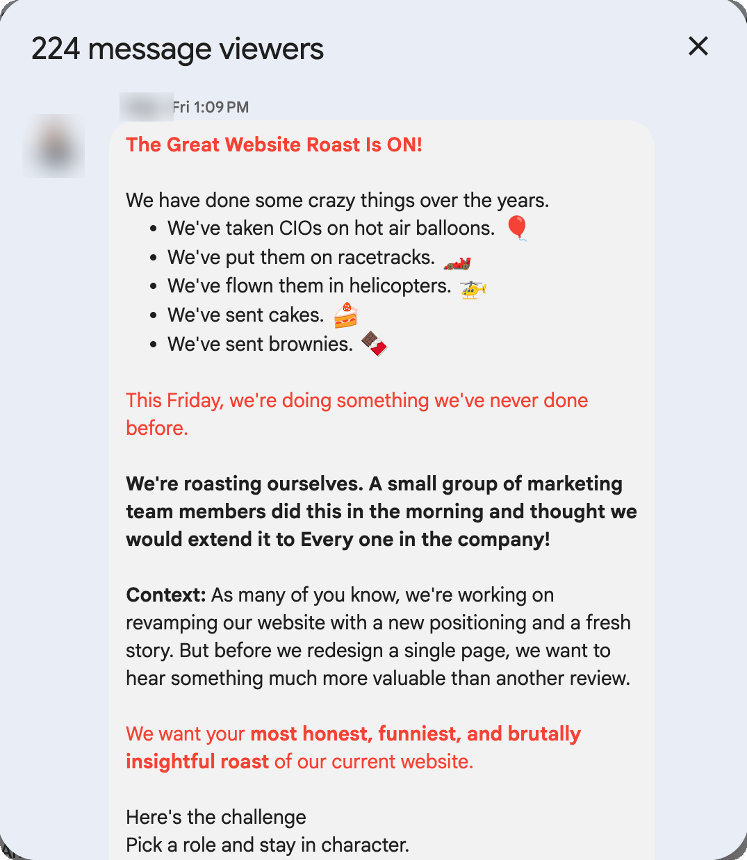
*The actual brief that kicked it off. Names masked, the dare was real.*
I am a documentation manager, not an engineer. I do not ship the product. But I read for a living, and the one thing a reader cannot forgive is not knowing where they are. So I took the bait. I opened the site like a stranger with a budget and a short attention span, and I tried to answer one question. What is this?
I could not. Not because the writing was bad. Because the site had not decided. One page spoke one language, the next page spoke another, and a careful visitor was left holding four half-answers and no whole one. I wrote it up, had a good laugh, and then a quieter thought arrived and would not leave. This was not a wording problem. It was a deciding problem. And deciding, it turns out, is the part nobody wants to do.
## The roast wrote itself
Here is the uncomfortable thing about looking at your own work as a stranger. The flaws are not hidden. They are sitting in plain sight, protected only by the fact that everyone who works there already knows what the company means, so nobody reads the page cold anymore. Familiarity is [a kind of blindness](https://hbr.org/2006/12/the-curse-of-knowledge). The roast was easy because I made myself forget.
Rather than itemise a colleague's hard work in public, I will keep the specifics in the family. The shape of it is what matters, and the shape is universal. A platform that does many things gets described many ways, once per team that owns a page, and the descriptions quietly compete instead of combining. Each one is true. Together they cancel out. The visitor does not get a richer picture. They get a blurrier one.

*Four true labels, pulling four ways. Each one is correct. Together they read as confusion.*
I have lived this from the inside, so I am not throwing stones. Documentation has the same disease in a different outfit. Ten writers describe the same feature ten reasonable ways, and the reader pays for our refusal to pick one. The website just made the cost visible, on the front door, in marketing font.
> **!** A thing described four ways is not four times as clear. It is a quarter as clear, and twice as tiring to read.
## Roasting is cheap. Rebuilding is the tell
A roast with no follow-through is just complaining with better timing. The real revamp belongs to the marketing team, not to me. I sit in documentation, well outside that call, and nobody asked me to redraw their homepage. But the contest was open to everyone, so I gave myself a harder version of the assignment. Do not tell them what is wrong. Show them what right could look like. By the weekend I wanted a real homepage, not a slide. Something a person could open in a browser and click.
I cannot hand-write that. What I can do is direct it. I work with AI tools the way a documentation lead works with a room of fast, literal contributors. I decide, they execute, I check. The building was genuinely the easy half. I described a dark stage, a single living mark made of brand-colored light, one category line, and the AI produced [a working, animated site](https://abhiram-kissflow.github.io/kissflow-agentic-os/). When I asked for proof and trust sections it built those too.
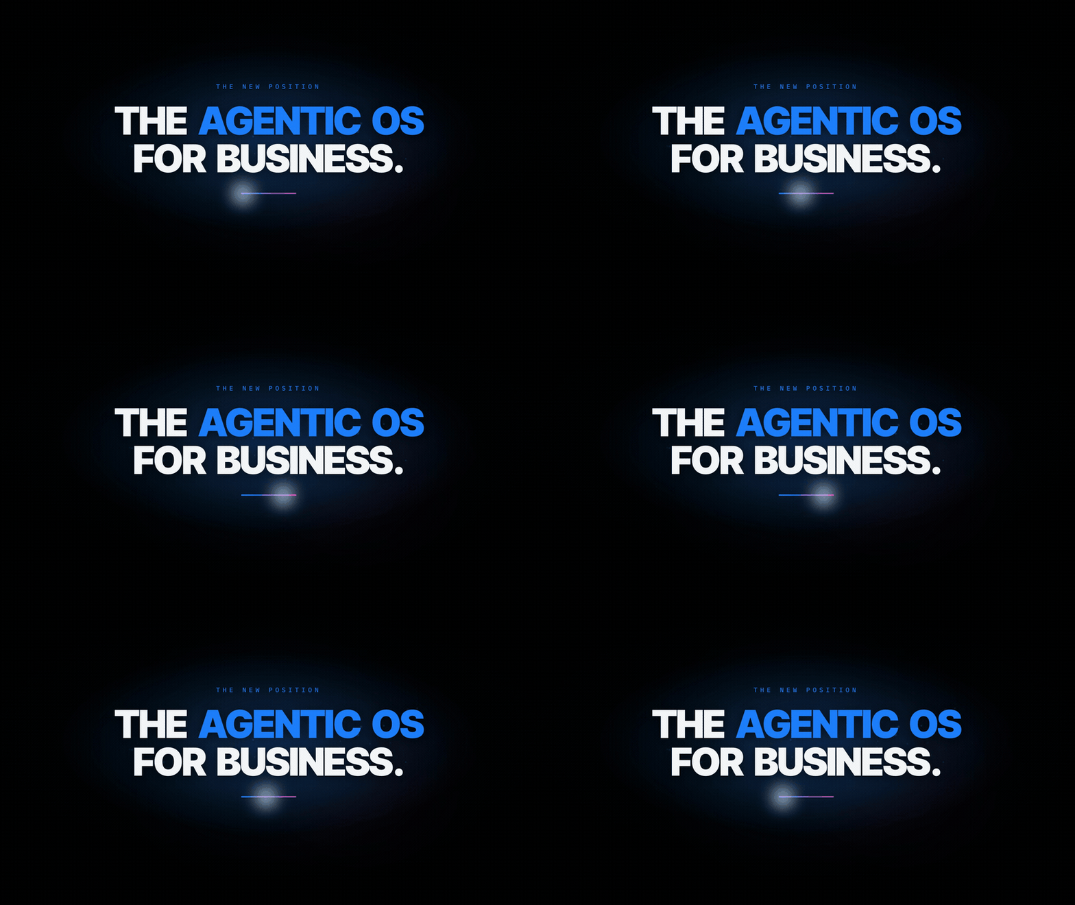
*One category. One sentence. The whole rebuild was an argument for picking a lane.*
The speed was almost a trap. When a tool can build anything in minutes, the bottleneck stops being effort and becomes judgment. I could generate ten heroes before lunch. Choosing one, and killing the other nine without flinching, was the actual work. Every time I stalled, the project stalled with me, and it was never because the AI was slow.
> When building gets cheap, deciding becomes the whole game.
## This is the part that maps to Federer
There is [a stat I keep coming back to](/posts/essays/the-54-percent-rule/). Across his career, Roger Federer won almost half his matches while [winning barely more than half the individual points](https://home.dartmouth.edu/news/2024/06/2024-commencement-address-roger-federer). The points are nearly a coin flip. The matches are not. The difference is not effort on every point. It is judgment on the few that decide the set.
A weekend rebuild runs on the same math. Hundreds of small choices barely move the result. A handful decide everything, and they are almost always decisions, not tasks. What is this one thing? What gets cut so the one thing can breathe? When do I stop polishing a section that was already good enough an hour ago? Win those few and the ordinary points take care of themselves. Lose them and no amount of pretty animation saves you.

*Most choices are coin flips. A few are the match. Spend your nerve on those.*
## The mistakes were not the disaster
I want to be honest about the middle, because the clean version is a lie everyone tells. It did not go smoothly. The deploy broke on a setting I had wrong. A batch of my AI contributors quietly did nothing and reported success, so I had to notice the silence and send them back. Text from three sections stacked on top of itself and made the page look like a ransom note. A cache corrupted right before the final render.
None of that was the disaster. The disaster would have been treating any one of them as proof the whole idea was bad. A setback at hour nine feels like a verdict. It is almost never a verdict. It is a task with a bad attitude. The move is to fix the one broken thing and [protect the decision you already made](https://s2.q4cdn.com/299287126/files/doc_financials/annual/2015-Letter-to-Shareholders.PDF), instead of reopening the whole case every time something snags. Catastrophising is just indecision wearing a costume.
> **!** A broken deploy is a task. Deciding the project is doomed because the deploy broke is a mistake. Keep those two apart and most bad days get a lot shorter.
## What the AI age actually changes
Here is the larger thing the weekend taught me, and it is bigger than one website. For years our category described how the work got made. Faster tools, fewer steps, less code. That was a real answer to a real question. But the question is changing. The new one is not how fast a person can build. It is whether the software can act on its own, safely, inside a business that has rules.
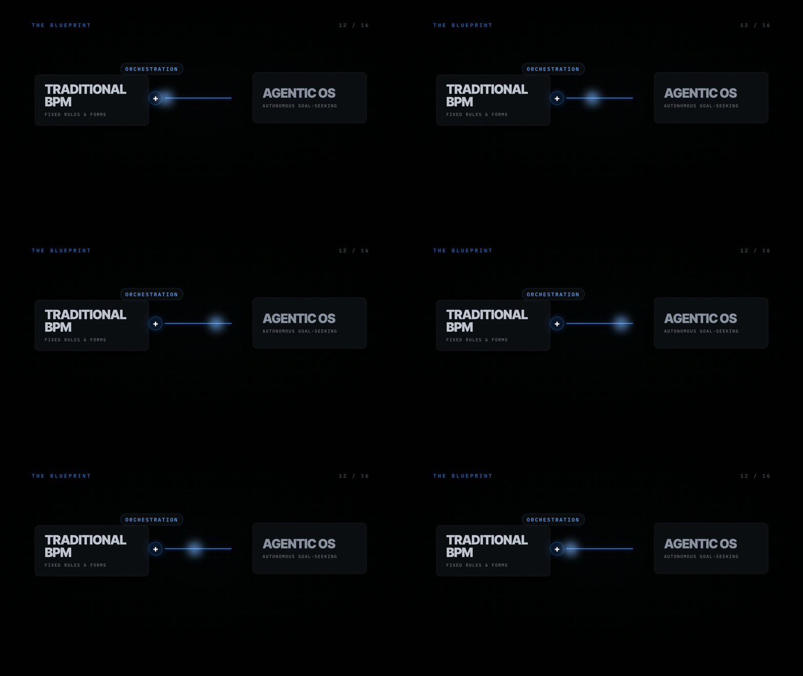
*The argument in one frame. The boring, structured foundation is exactly what an agent needs to act without breaking things.*
The irony I enjoyed most is that the unglamorous parts turned out to be the advantage. Rules, permissions, structured data, audit trails. The stuff nobody puts on a banner is precisely the body an autonomous agent needs so it can act without doing something expensive and irreversible. A model can think. It cannot be trusted to act inside a company until something deterministic is holding the guardrails. The old, careful foundation is not the thing to apologise for. It is the thing to lead with.
But you only get to make that argument if you decide to make it. The whole exercise kept rhyming with itself. The original sin was four answers to one question. The fix was not better words. The fix was the nerve to choose one answer and let the page be quiet about everything else.
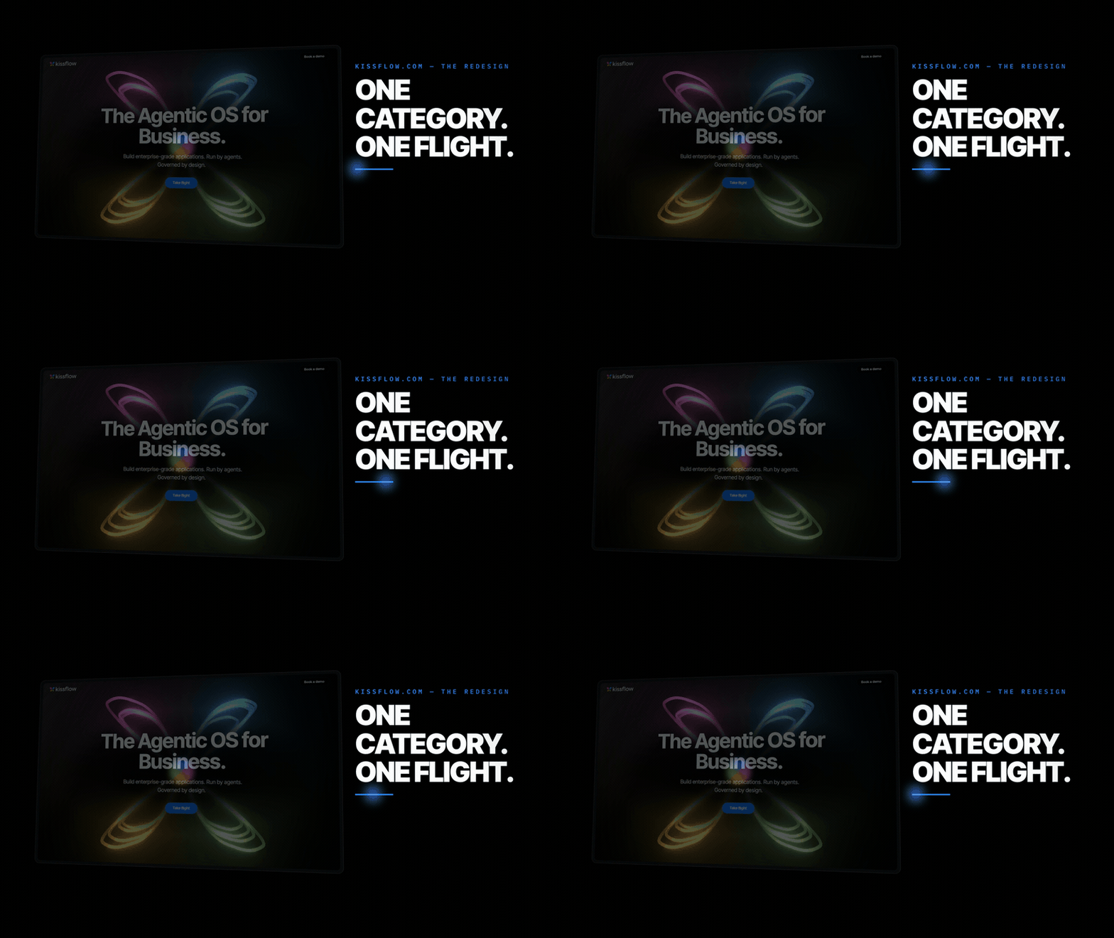
*[My weekend rebuild](https://abhiram-kissflow.github.io/kissflow-agentic-os/), not the shipped site. Not because the design is clever. Because it picked one thing and meant it.*
## What I am taking back to the day job
I did not set out to learn anything. I wandered into another team's contest to win it with a joke. But the lesson followed me back to the work I actually get paid for, which is not theirs and not this. Documentation is positioning at a smaller scale, one page at a time. Every help article is a tiny version of the same test. Did we decide what this page is for, or did we hedge and let the reader sort it out?
The tools will keep getting faster. Mine already build in minutes what used to take a week. That does not make the work easier. It moves the work. The scarce thing is no longer the making. It is the deciding, and the nerve to defend a decision through a few ugly hours without reopening it every time something breaks.
So I am keeping the roast pinned where I can see it. Not as a dunk on a website. As a reminder that the most expensive bug I will ship this year will not be a typo or a broken link. It will be the moment I had four good answers and could not bring myself to choose one.
> Pick the answer. Cut the other three. The page, and the reader, will thank you for the silence.
*Built over a weekend with AI tools, a documentation manager's stubbornness, and one good contest brief. The roast was the fun part. The deciding was the point.*
---
# How I Cut My AI Bill Without Talking Less
URL: https://abhiram.cyou/posts/essays/ai-token-valves/
Published: 2026-06-26
Tier: essay
Tags: ai, claude-code, tokens, cost, workflow

I spent a bit over $1,700 in a month talking to a robot. Then I found out I only paid a hundred. The gap is the whole story, and most of it is plumbing you set once and forget.

Last week I ran a small script that adds up what I spend inside [Claude Code](https://claude.com/claude-code), the AI coding tool I live in. The number came back at a bit over $1,700 for the month. About eighty dollars on the days I actually used it. I am a documentation manager, not an engineer, so my first instinct was guilt. Maybe I should just use it less.
That instinct is wrong. It took me a while to see why. A token is the unit an AI charges by. Every word you send it and every word it sends back has a price. The obvious way to spend less is to type less and ask for less. But that is willpower, and willpower fails by Wednesday. The thing that actually works is plumbing. You install a few valves in the pipe, set them once, and they keep saving while you forget they are there. I have five, plus two that were free the whole time.
## The valve on *every* command
The first one sits on every command the AI runs. Claude Code does real work in my terminal. It lists files, searches code, reads documents. Each one dumps its output back into the conversation, and that output is tokens I pay for. So I switched on a small hook called RTK in front of all of it. Before any command runs, RTK quietly rewrites it to a leaner version and trims the noise out of the result.
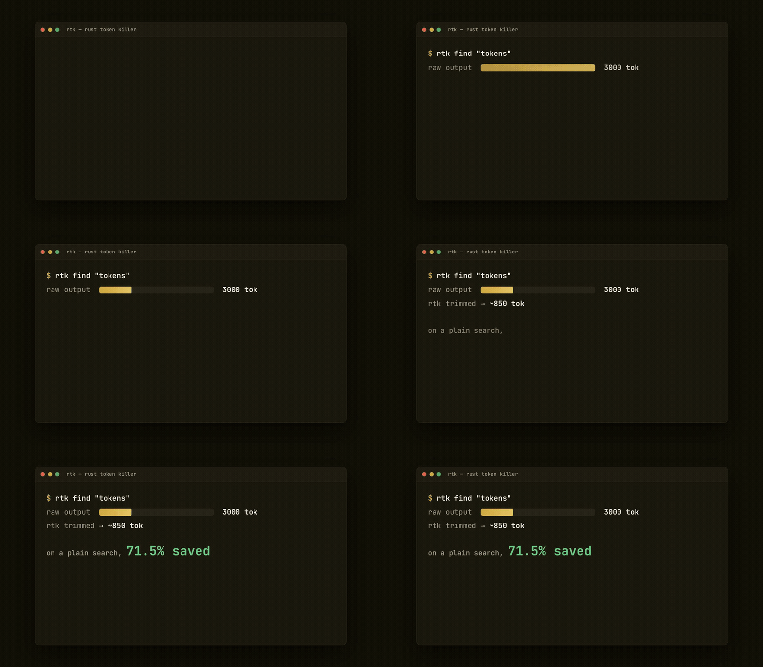
A raw file search might hand back three thousand tokens of paths I will never read. RTK returns the same answer in about a third of that. On a plain search it cuts more than seventy percent. I did not change a thing about how I work. A single line in a config file does the work for me, on every command, forever.
## Cutting the *padding* out of the reply
The second valve points the other way, at what the AI says back. I keep a mode switched on called [caveman](https://github.com/JuliusBrussee/caveman) that strips replies down to the bone. No "I would be happy to help," no throat-clearing, no three sentences where one fragment will do. The substance stays. The padding dies. If you have ever watched an AI write a whole paragraph to say "yes," you know how much there is to cut. The answer lands shorter, the bill lands smaller, and honestly I read faster too.
Next to it runs a third persona named [ponytail](https://github.com/DietrichGebert/ponytail). It makes the AI behave like a tired senior developer who got paged at 3am and wants to write as little code as possible. Fewer lines generated means fewer tokens generated. But here is the part I did not expect. The laziest correct solution is usually the one I can actually maintain. Saving money and getting cleaner work turned out to be the same lever.
> You do not save tokens by thinking smaller. You install a valve and forget it exists.
## The menu nobody *caps*
The fourth one I am quietly proud of, because almost nobody talks about it. Every session loads a menu of the tools and skills the AI can reach, and that menu costs tokens before I have asked for a single thing. Mine had grown long, dozens of skills deep. So I capped it. One setting tells Claude Code to spend no more than two percent of its budget describing that menu on the way in.

The skills are all still there. They just stop reciting themselves at length every time I open a session. It is the difference between a waiter reading you the entire menu and one handing you a card. Same kitchen, far less talking.
## The valve on the way *in*
The fifth one I almost forgot I had, which is the point. When I reference a heavy file, a PDF, a slide deck, a spreadsheet, a hook called [markitdown](https://github.com/microsoft/markitdown) catches it before it ever reaches the model. It converts the thing to clean markdown and quietly tells the AI to read that instead of the raw binary.

RTK is a valve on what comes back. This is a valve on what goes in. A forty page PDF is enormous in its native form and small as plain markdown, and I never lift a finger. The file shows up already converted, every time.
## The tools I don't *load*
Claude Code can reach a whole shelf of outside tools through something called [MCP](https://modelcontextprotocol.io). A browser driver, a design app, a support inbox, a chart maker. Each one comes with a manual the AI has to read before it can use it, and those manuals are not small. Load every one up front and they crowd the window before I have typed a word.
So they sit deferred. Connected, listed by name, but their manuals stay on the shelf at almost no cost. The moment I actually need the browser tool, that one manual loads, the call runs, and the result comes back. I pay for the one I reached for, not the forty I did not.

It is the same idea as the menu cap, one floor down. Do not pay to hold a tool you are not using. And here is the cost people forget: when an MCP tool does run, its answer lands in the conversation and stays there, re-read on every later turn. Cheap to keep on the shelf. Not free once you call it.
## The valve that was *free* all along
Here is the one I missed completely, and it turned out to be the biggest. Every time the AI takes a turn, most of what it reads is the same as last turn. The system prompt, the tool definitions, my config, my saved memory. That stable block sits in a [cache](https://www.anthropic.com/news/prompt-caching) and gets re-read at about a tenth of full price. I did not install it. It was on the whole time.

So I went looking for the catch, and I found it in my own setup. A couple of my hooks inject a little text into every single prompt. One stamps the current time. Another reminds me about a workflow option. Tiny things. But because they change every turn, they land outside the cached block, and a changing block is never a cache hit. The free valve was leaking, and I was the leak. That is the honest part nobody puts in these posts. The plumbing is only as good as the person who stops poking holes in it.
## What each valve actually *cuts*
I wanted one number for all of it and could not get an honest one, because I never ran a month with the valves off to compare against. So here is the next best thing, measured per valve where I have the data.

The caching bar is the tallest for a reason. The cheapest token is the one you already paid for and get to reuse.
## The number that *actually* matters
Now the part that reframes everything. That script of mine prices every token at the public API rate. By that math I burned about $1,730 in a month. But I do not pay the API rate. I pay a flat hundred dollars for a Claude subscription, the same hundred whether I use it once or all day.
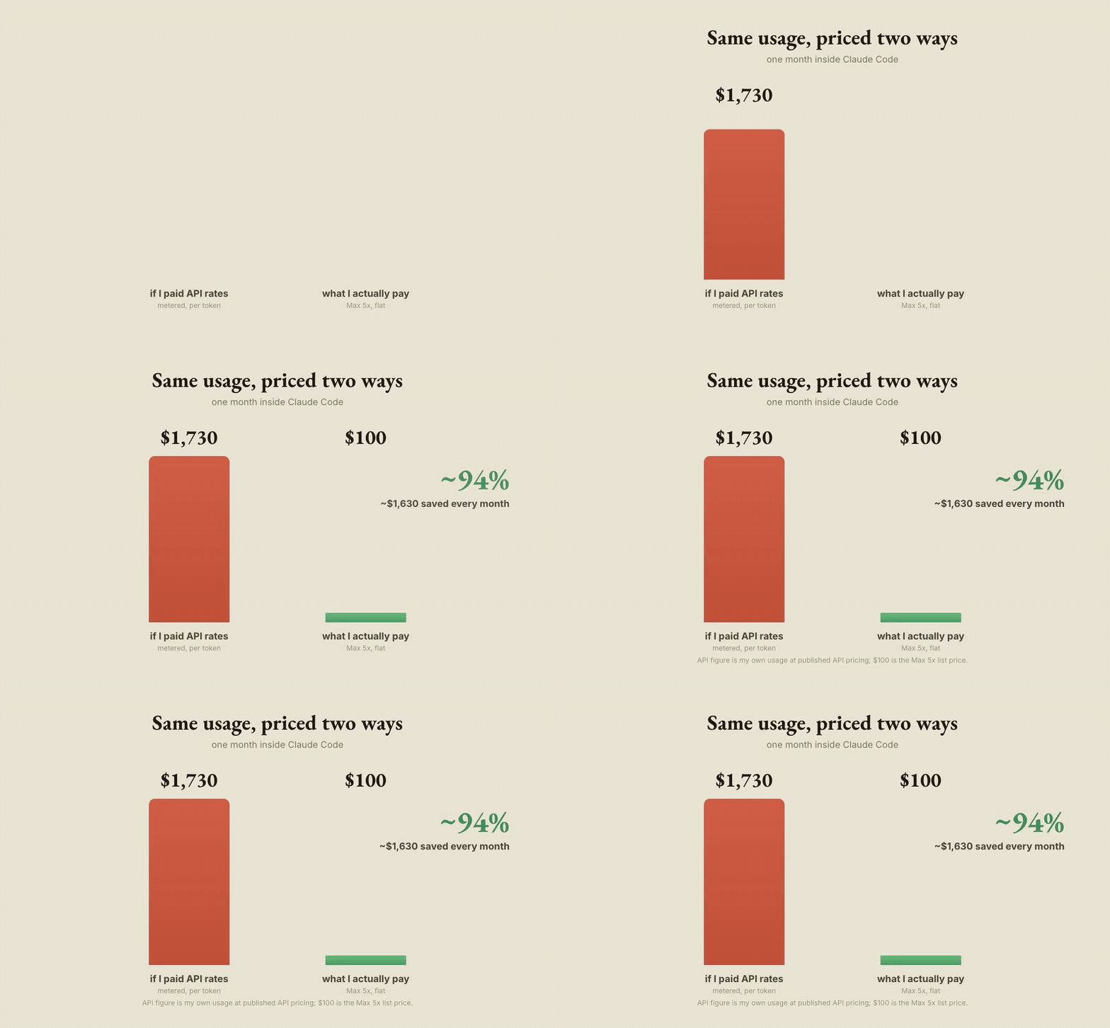
So the valves shave the metered cost, sure. But the subscription is the real lever. Same usage, priced two ways, and the flat plan saves something like ninety four percent against the metered version. The valves are good hygiene. The plan is the bargain.
## The honest counterpoint
If I am going to brag about valves, I owe you the leaks too. One setting on my account makes the AI add little teaching asides to its answers. I like them, but they are extra words, which is extra tokens, working directly against caveman and ponytail. The per-prompt reminders I mentioned do the same in miniature. And I run the model on its most thorough setting, which thinks longer and writes more by design.
None of these are mistakes. They are choices, and some of them I will keep. But a post that only lists the savings and hides the spending is selling you something. There is also a tool I reach for by hand called [graphify](https://github.com/safishamsi/graphify), which turns a whole codebase into a map I can query instead of opening forty files. That one genuinely saves, but it is a move I make, not a valve I forget. Worth knowing the difference.
## Measure, then *forget*
None of the valves are clever on their own. The trick is that I never have to remember any of them. The hooks fire whether I am paying attention or not. The modes stay on across every session. And once a week I run that same little script, see the number, and adjust if it has drifted. That is the entire system. Not "use the AI less." Measure, install a valve, forget it, check the meter, and now and then go find the hole you punched in your own cache.
> **!** The order matters. Without the weekly number I would never know which valve was working, or that my own hooks were leaking the cached one, and I would be back to guessing and rationing.
The month I started, I was bracing to put myself on a budget. Instead I let the plumbing do the rationing, and the flat plan do the rest. I still ask the AI for everything I want. It just costs a good deal less to want it.
*Written from my own Claude Code config, one valve at a time.*
---
# How I Built a Product Promo, End to End, Without Writing the Code
URL: https://abhiram.cyou/posts/essays/building-a-promo-without-code/
Published: 2026-06-25
Tier: essay
Tags: ai, video-production, documentation, craft, workflow
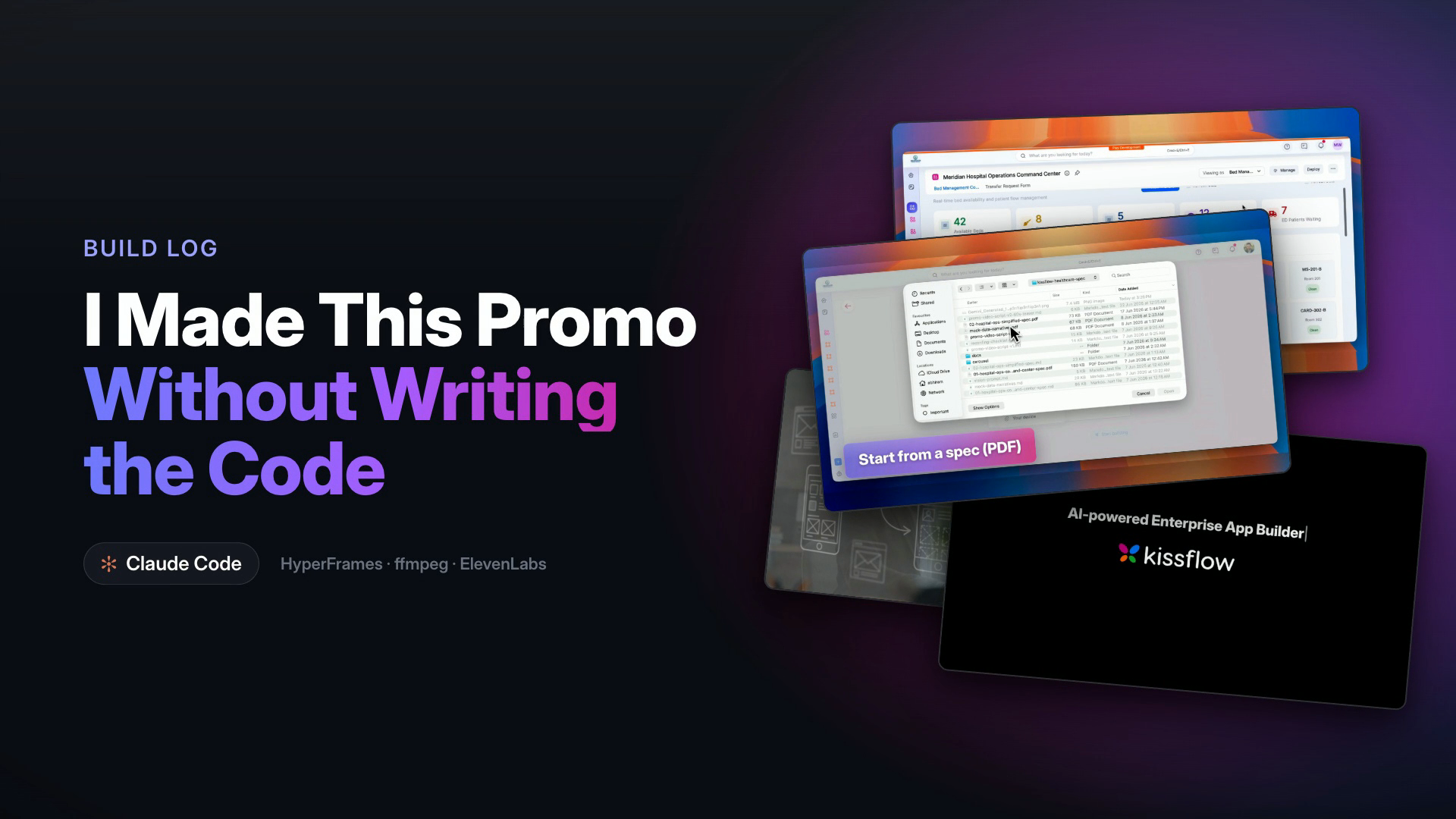
We were launching a new AI feature, an app builder, and it needed a promo. A sixty-second teaser, not a tutorial, the kind that makes someone feel the shift and want to try it. I run the documentation team. I am a words person. I have never written a line of video code in my life.
I built the whole thing anyway, start to finish, with AI doing the hands-on work and me directing. This is the honest walkthrough of how, every stage of it, so you can run the same pipeline. None of it needs you to be an engineer. All of it needs you to know what good looks like and to keep saying so until you see it.
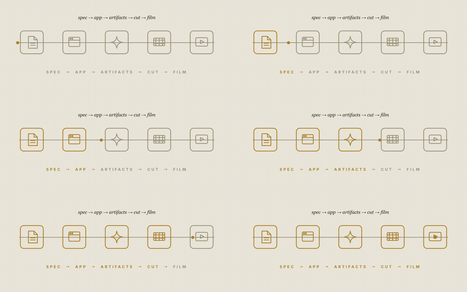
Here is the shape of the work before we go deep. Nine stages, roughly in order, though in practice they loop.
1. **Set up the workshop.** The tools and environments, wired once.
2. **Pick the use case.** The one app the whole film will show.
3. **Write the spec.** A requirements document detailed enough to build from.
4. **Build the app with AI.** Spec in, working enterprise app out.
5. **Write the script.** The beat sheet and the voice, locked to a house style.
6. **Generate the artifacts.** Invented images and b-roll, then cleaned up.
7. **Record the screens.** Real captures of the real app.
8. **Cut it together.** Assemble, trim, add transitions.
9. **Caption and composite.** Text overlays, glass cards, the end card.
## Stage 1: Set up the workshop
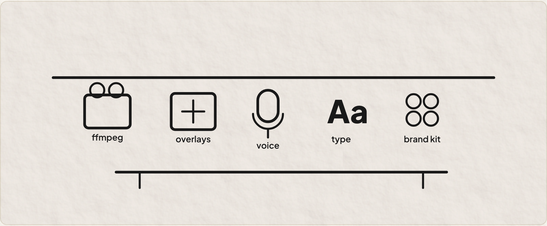
Before any of the fun, you wire the bench. This is the unglamorous part nobody blogs about, and skipping it is why people give up on day one. My setup: **[Claude Code](https://claude.com/claude-code)** running the Opus 4.8 model as the agent in the terminal that conducts everything, **[ffmpeg](https://ffmpeg.org)** for every video operation, **[HyperFrames](https://github.com/heygen-com/hyperframes)** for the motion-graphics overlays, **[ElevenLabs](https://elevenlabs.io)** for the voiceover, the open-source **[Inter](https://rsms.me/inter/)** typeface, and the real brand kit so the logo is never the garbled AI version.
Two of those are worth a special note. HyperFrames and a video pipeline called **[video-use](https://github.com/browser-use/video-use)** are structured *skills*, packaged recipes the agent loads on demand for one kind of job. A skill is the difference between asking an agent to wing it and handing it a checklist it has run a hundred times. On a job this sprawling, leaning on them is most of what kept it from sliding into chaos.
One real gotcha lives here. The overlay tool needed a newer runtime than my default, and the first render quietly flattened the transparency. Five minutes of pointing it at the right runtime fixed it. Workshops are like that. Sharpen the tools first, or every later stage bleeds time.
> **!** The boring setup stage is load-bearing. A half-wired bench does not announce itself. It just makes every later step mysteriously fail.
## Stage 2 & 3: The use case, and a spec the AI can build from
A promo is only as good as the thing it shows. I picked one concrete, believable enterprise scenario, a hospital operations command center, the kind of app a real business user would actually need. One use case, shown well, beats five shown shallowly.
Then the part that surprised me most: the app was not mocked up. It was genuinely built, from a written specification. I wrote a requirements document, the screens, the roles, the data, the logic, and handed it to the AI app builder. A long, plain-language spec went in. A working app came out, with real roles, real forms, a real approval process, real dashboards with live numbers.
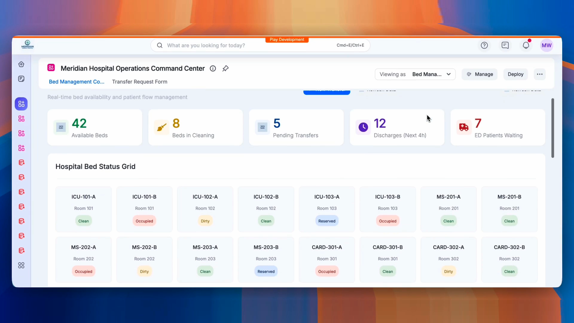
This matters for the promo because it is the actual claim of the product. So the film could show the real thing doing real work, not a pretty fake. If you are documenting a product, you already know how to write a spec. That skill ports straight over.
## Stage 4: Write the script, and respect the house style
The script is where a promo lives or dies, and it is pure writing, no tools required. We had a house style locked from an earlier teaser, and I held to it hard. Subdued and confident, not loud. No manufactured frustration, no villain, no urgency cuts. The product meets the viewer where they already are. The voiceover is unhurried. You let the lines land.
Structurally it is a two-column beat sheet, script on the left, the exact visual on the right, with rough timecodes. A single visual thread bookends the film: the app you imagine appears as a faint sketch at the open, resolves into the real thing, and returns at the close. That spine is what makes sixty seconds feel composed instead of scattered.
> *Restraint is the brief. The confidence comes from stillness and clean product motion, not from energy.*
## Stage 5: Generate the artifacts, then clean them up
Not everything is a screen recording. The film opens on a person at a desk with the imagined app drifting around them as faint wireframes. There is no stock footage budget and no shoot. So those shots were generated. I used an image model for the invented stills and a video model for the short b-roll clips, described in plain language, the same way I would brief a photographer.

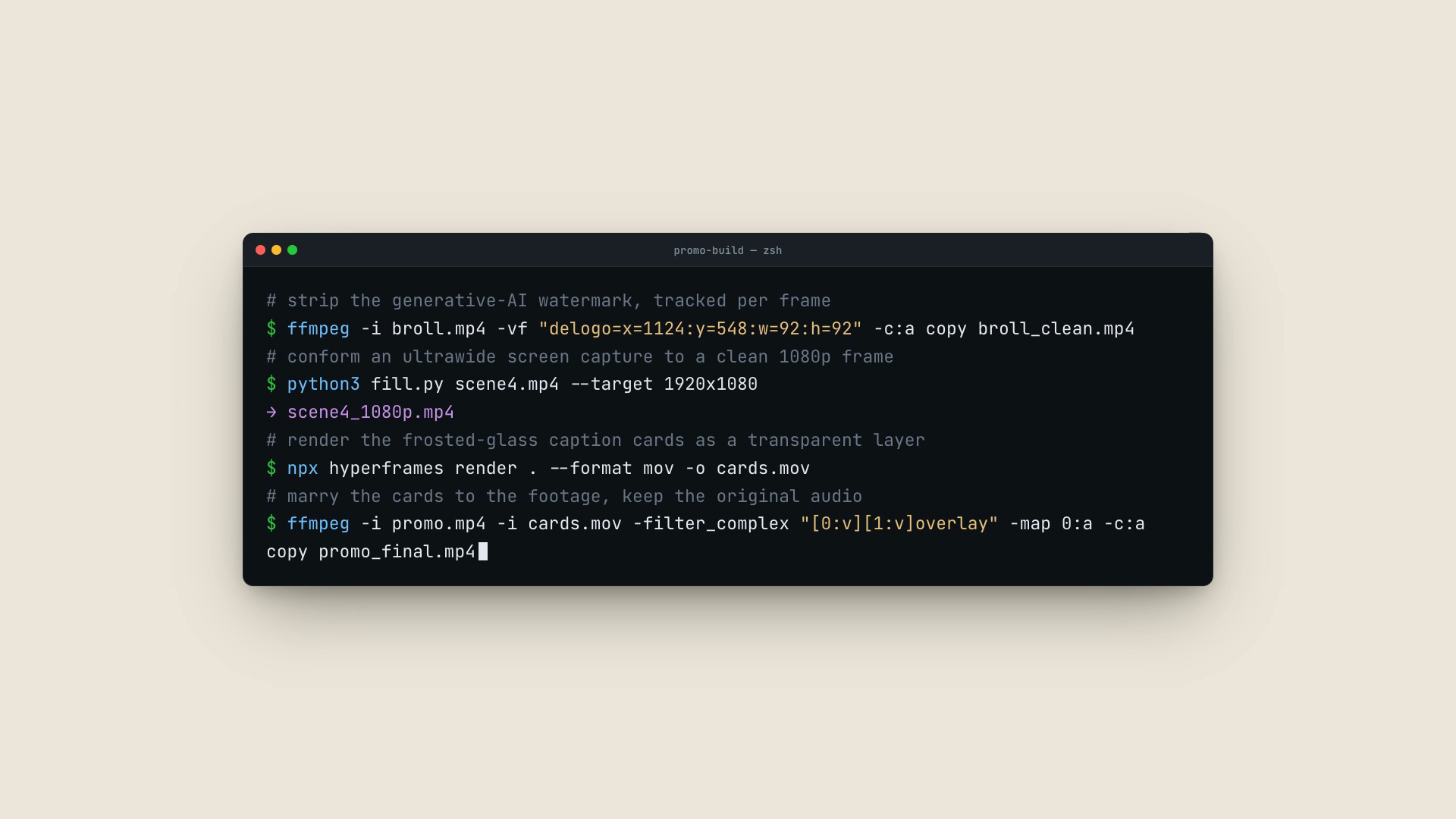
Generated footage comes with a tax, though. The clips arrived with the model's watermark stamped in a corner, the b-roll was an odd ultrawide size, and the AI-rendered logo was a garbled rainbow smudge instead of our real four-petal mark. None of that is acceptable in a brand film. All of it is fixable with a couple of commands, which I described and the agent ran.
```bash
# strip the generative-AI watermark (a moving target, tracked per frame)
ffmpeg -i broll.mp4 -vf "delogo=x=1124:y=548:w=92:h=92" -c:a copy broll_clean.mp4
# conform an ultrawide capture to a clean 1080p frame, no stretch
python3 fill.py scene4.mp4 --target 1920x1080
# → scene4_1080p.mp4
```
One of those watermarks was not even static. It was a little badge that drifted and shrank as the shot zoomed, so a single fixed patch could not cover it. It had to be followed across two hundred-odd frames, each a different size and position, the background rebuilt underneath it every time. I could not have written that tracker. I could describe the problem precisely and check the result at four timestamps. That division of labor is the whole game.

Not every artifact was visual. The narration itself was generated, not recorded in a booth. I had **ElevenLabs** read the script back as text-to-speech, calm and even, matched to the restrained tone the house style asks for. One more asset described in a sentence and produced on demand.
## Stage 6 & 7: Record the screens, then cut it together
The product footage is real. I recorded the app with a clean screen-recorder, beat by beat, matching the script's right-hand column. Slow, deliberate captures, one per moment the script calls for. Recording to the script, not freestyling, is what saves you in the edit.
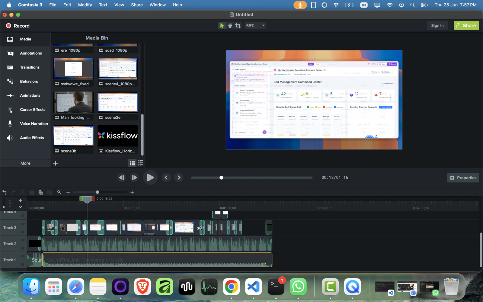
Then the assembly. This is the one stage where I sat in a traditional editor, **[Camtasia](https://www.techsmith.com/camtasia)**, on a timeline, laying clips across tracks, trimming each to its beat, and dropping smooth transitions between them so nothing hard-cuts. Generated b-roll and screen captures on the upper track, the ElevenLabs voiceover and a bed of background music on the audio tracks below, holding the timing. The editor is where the separate pieces finally become a film.
That editor could have been a browser tab. **[OpenCut](https://opencut.app)**, an open-source tool formerly called AppCut, gives you the same timeline, the same tracks and trims and transitions, running locally in the browser with nothing uploaded to a server. It is younger and rougher than a paid desktop app, and the transition set is thinner, but for a short promo it covers the job, and the privacy is genuine. The footage never leaves your machine.
There is a stranger option, and it is the one I keep circling back to. You can drop the timeline and write the edit as code. **[Remotion](https://www.remotion.dev)** treats a video as a function of frames, built in React and rendered by a script instead of a mouse. **[ffmpeg.wasm](https://ffmpegwasm.netlify.app)** runs the ffmpeg command line inside the browser, so a cut becomes an instruction, not a drag. That is a different sense of "in the browser" than OpenCut. One puts a familiar editor in a new place; the other turns the assembly itself into something you generate, which is the same move the rest of this promo already made. I did not go that far this time. I sat in Camtasia and moved clips by hand. But the timeline is the last manual island in an otherwise generated pipeline, and it is the one I expect to close next.
## Stage 8: Caption and composite, where the polish lives
Now the part I obsessed over, and the part that taught me the most. The cut had no on-screen text, and a silent promo loses people. So it needed captions. The first pass was bad. White text on a dark strip along the bottom, every caption the same, the visual equivalent of a monotone. It was technically correct and completely lifeless.
So I told the agent, plainly, that it had done a terrible job. The bluntness mattered. I was refusing to accept "it works" in place of "it is good." Those are different finish lines, and the whole job is knowing there is a second one.
> **!** "It works" and "it's good" are different bars. The machine happily stops at the first. Knowing there is a second one is your contribution.
But "terrible" is a feeling, not an instruction. What actually moved the work was getting specific. Make it extra-bold. Make it bigger. Stop parking everything at the bottom, move the cards around the frame. Put them in translucent gradient-glass cards in our brand colors, so the screen blurs softly behind the text instead of fighting it. Every one of those is a sentence a non-coder can write.
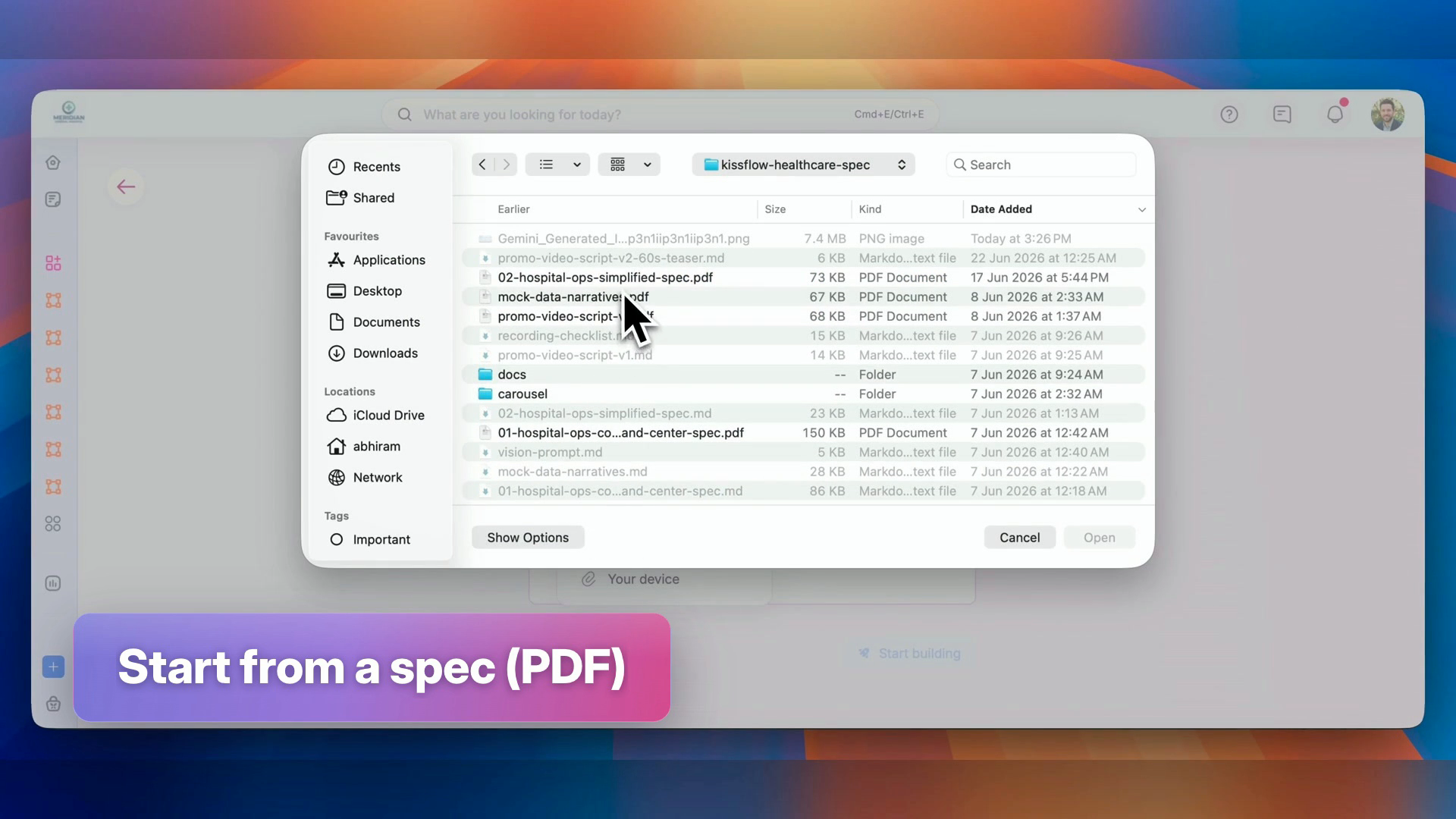
The cards themselves were built as code I could actually read, an HTML composition with the gradient, the glass blur, and the easing all spelled out, rendered to a transparent layer. For that I used **HyperFrames**, which authors motion graphics as an HTML page you can read and then render straight to video. The whole caption-and-composite stage ran through the **video-use** skill, which owns the cut-and-overlay mechanics so I could stay focused on how it looked instead of how it was wired. Getting real frosted glass meant a non-obvious trick: the footage had to sit *behind* the cards inside the composition, because a blur needs something to blur. A floating transparent layer has nothing behind it.
Then two tools did what each was good at. HyperFrames drew the caption cards. ffmpeg married that layer onto the footage and kept the original audio intact. The render and composite commands are below, and that whole back half of the pipeline is work I described and checked but never wrote by hand.
One more honest moment here. Midway, I suspected the fancy tool I had asked for was not actually running, that a simpler path was quietly doing the work instead. So I asked the dumbest possible question: did these two tools actually work together to build this? The answer was no. Knowing that changed the next instruction and jumped the result a level.
That verifying question comes straight from documentation work. You do not trust that the button works because the spec promises it does. You press the button yourself.
> *In a loop with a machine, the most useful thing you can say is often the dumbest: prove it.*
## Stage 9: The end card, and knowing when to stop
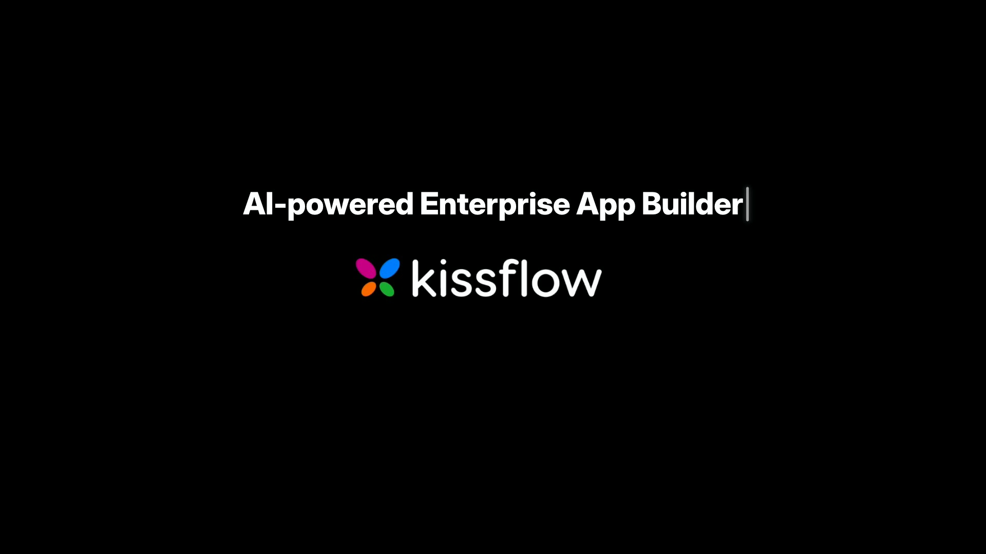
The film closes on the product name resolving above the real logo. Simple, but it took three rounds. Too big and it crowded the logo. Too tight and it looked cramped. The fix was nothing clever, just looking, nudging the size and spacing, and looking again until the gap felt right. That loop, look and adjust and look, is most of what design actually is.
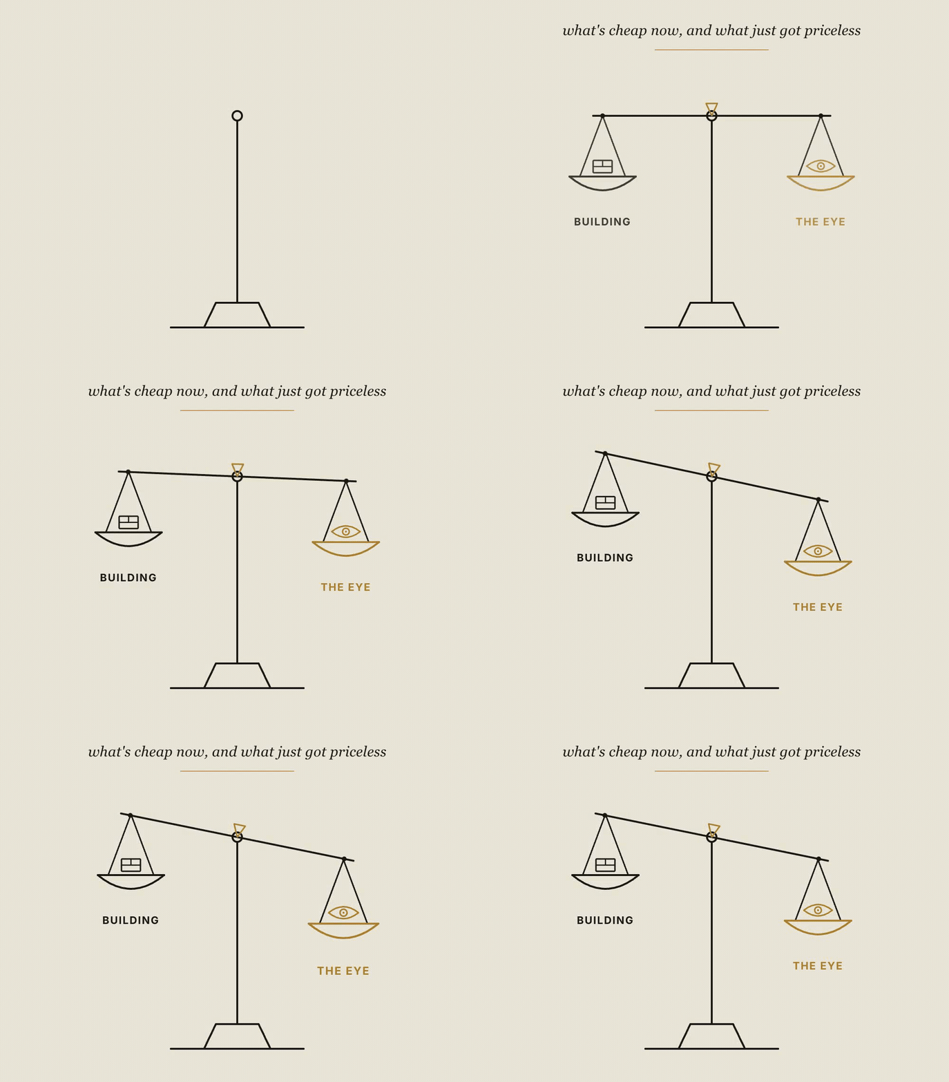
## The hands got cheap. The eye got expensive.
Here is what I keep coming back to. Every building step in those nine stages collapsed into plain English. The tracking, the gradients, the easing, the compositing, the rendering, all of it became something I could ask for instead of something I had to know how to do.
But a whole set of things did not collapse. Picking the one use case. Holding the script to a restrained house style. Knowing the bottom strip was lazy and extra-bold read better. Knowing the end card was crowded. Asking whether the thing actually did what it claimed. None of that is a coding skill. It is taste, judgment, and editing, and editing is literally my job.
The work did not disappear when the tools got good. It moved up the stack, from the hands to the eye. And the eye is the part you cannot download. It only comes from years of caring whether something is good.
> **★** You don't need to know how to build it. You need to know when it isn't good enough yet, and the words to say why.
If you want to make a promo like this, the pipeline above is the whole map. Set up the bench, pick one real use case, build the real thing, write with restraint, generate and clean what you cannot film, record to the script, cut on a timeline, and caption with care. The tools will do the hands-on work. Your job is to keep looking until it is good. So learn to see. The seeing is the job now.
*Written the day a sixty-second promo taught me where my job actually lives.*
---
# The 54% Rule: Five Circuit-Breakers I Use to Lead a Writing Team
URL: https://abhiram.cyou/posts/essays/the-54-percent-rule/
Published: 2026-06-19
Tier: essay
Tags: leadership, decision-making, writing

Roger Federer won eighty percent of his matches. He won only [fifty-four percent of the points](https://home.dartmouth.edu/news/2024/06/2024-commencement-address-roger-federer) inside them. Once that gap sank in, I started managing myself differently.
Let me start with a small confession.
A few weeks ago I shipped a documentation article I was proud of. Backup exports, schemas, decryption commands, the works. Three thousand words, every claim checked, the kind of piece I keep telling my team to aim for. Then a colleague ran one section past an AI model, and the model pushed back on something I had written about how data batches get split.
My first reaction was not curiosity. It was a small hot flush of *no, I checked that.*
Turns out the model had a point. I had gotten a detail wrong. So I went back, traced the data again, and fixed it.
Here is the part worth talking about. The fix took twenty minutes. The sulk almost took the whole afternoon. That gap, between the moment I made the mistake and the moment I actually let it go, is the entire game. Not the mistake. The gap.
I manage a small documentation team. Five writers, a roadmap built around surviving the way AI is rewriting our craft, and the usual run of deadlines, reviews, and decisions that have to happen before I feel ready to make them. Over the last year I noticed something uncomfortable. Almost every time I made a bad call, or froze, or stewed for too long, it traced back to one of five mental hijacks.
Doubt. Rumination. Over-analysis. Catastrophising. And the itch to pick a side before I had actually listened.
What follows is the set of circuit-breakers I now reach for. None of them started with me. I have just dragged each one into the world I actually live in, which is drafts, reviews, appraisal forms, and a Slack channel that never fully goes quiet. Here is the whole map first, then the five protocols one by one.

## 1. The believable *lie*
Every appraisal season I have to stand up and make the case for my team. Promotions, headcount, the story of why the work mattered. And every year, in the hour before, the same voice shows up. *You haven't prepared enough. They'll see straight through you.*
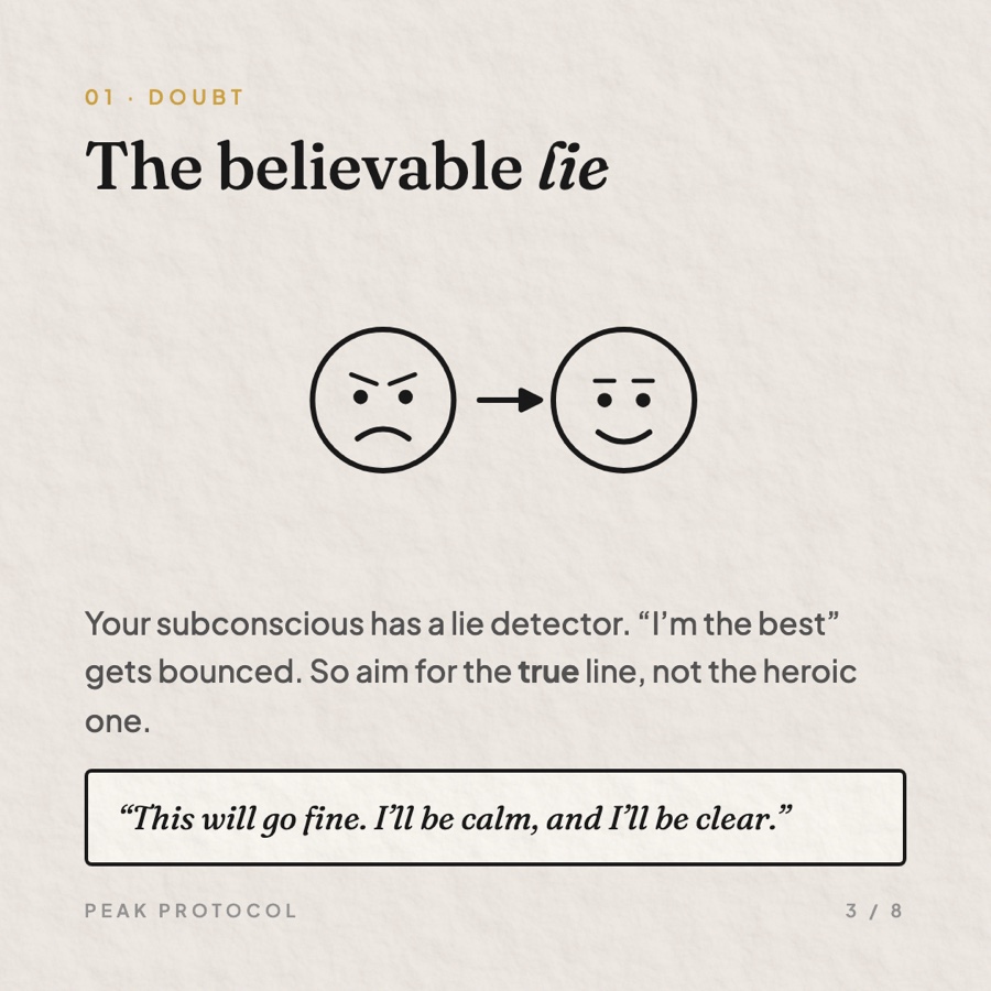
For a long time I fought it with pep talks. *You're the best person in this room.* It never worked, and now I know why. Some quiet part of me was checking that claim against the evidence, finding it shaky, and throwing it out. Your subconscious has a built-in lie detector, and it is good at its job.
So I stopped lying to it. The line I use now is small and true. *This is going to go fine. I'll be calm, and I'll be clear.* I cannot honestly promise myself I will be brilliant. I can promise myself I will be calm and clear, because I have been both before. The trick is not confidence. The trick is believability.
> If your self-talk has to get past your own lie detector, it has to be true. Aim for the plausible line, not the heroic one. "I'll be calm" clears the gate. "I'm unstoppable" gets bounced.
## 2. The 54% *rule*

Back to that documentation article and the AI model that caught my mistake.
Here is what I have learned to do in the seconds after I get something wrong, because I get things wrong all the time, and so will you. I let myself feel it. Five seconds, no suppressing, the small sting of *I missed that.* Then I name it in one plain sentence. *I described the batch split wrong.* Then I exhale, sit up, and go back to the work.
That is the whole protocol. Feel it, label it, reset, re-enter. It sounds almost too simple to bother with. But think about what usually happens instead. The mistake plays on a loop. You carry it into the next review and you are half-present. You snap at a writer over a comma because you are still annoyed about something else entirely. The lost point bleeds into the next three.
> If you have already pulled the lesson out of a mistake and you are still chewing on it, that is not learning anymore. That is just punishment.
The morning I fixed that article, I caught myself drafting a long mental defense of why my original version was almost right. That is the tell. The lesson was already extracted in minute two. Everything after that was me kicking myself for sport. The 54% rule says stop. Federer does not relitigate the backhand he netted. He walks to the baseline and plays the next one.
## 3. The first *thought*
When a draft lands in my queue, I usually know within two minutes whether it works. Not the line edits. The big call. Does this article actually answer the question a reader showed up with, or does it dance around it.
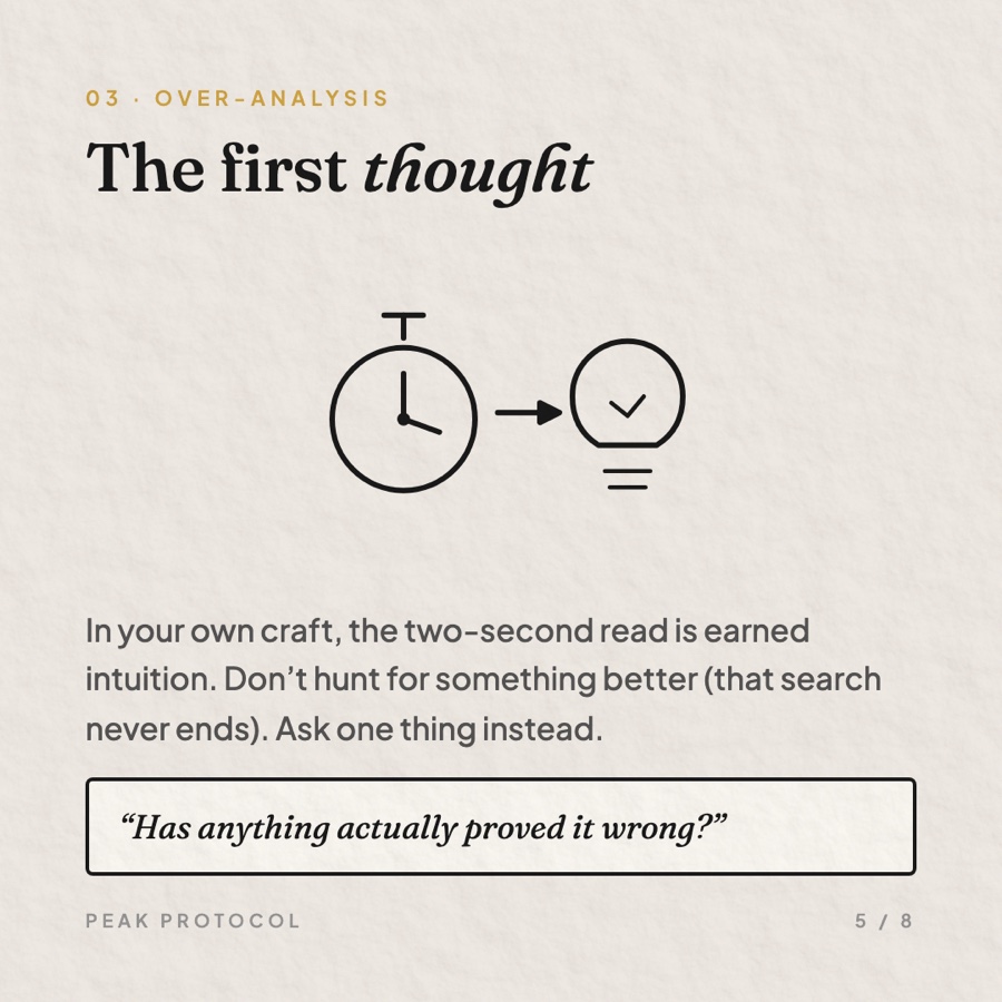
And then, for years, I would spend forty-five minutes talking myself out of that two-minute read. Rereading. Second-guessing. Hunting for a better framing that might be hiding somewhere. By the end I usually landed back where I started, just slower and less sure.
The fix that helped me most is a single question. Not *is there something better out there,* because that search has no floor and no end. The question is sharper. *Has anything I've read actually proved my first thought wrong?* If nothing has, I ship the first thought. If something has, I follow it. Either way I am out of the maze in minutes.
> This one comes with a warning label. First-thought speed only works in places where you have real reps. In my own craft, an instant read is earned intuition. In a domain I barely know, that same instant read is just bias wearing a confident face. No reps, no shortcut. Go find an expert instead.
The reason this works is not mysticism. Your deliberate, talking-out-loud mind is slow and narrow. The pattern-matching underneath it has watched a thousand drafts go by. Under a tight clock, the fast system gets to lead, and in a field you know well, it is usually right.
## 4. Inconvenience, or *problem?*
My team spends a lot of time these days staring down a genuinely big question. AI is reshaping technical writing in front of us, and it would be easy to treat every wobble as the beginning of the end. A tool ships that drafts decent docs. A workflow we owned for years gets automated overnight. The first word that arrives, every time, is *disaster.*
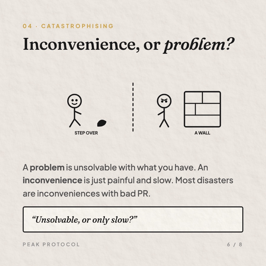
So I drew a line that I now use constantly. A **problem** is painful and genuinely unsolvable with what I have right now. An **inconvenience** is painful but solvable with some mix of time, hands, and effort. That is the only difference. And almost everything I had been filing under problem turned out to be an inconvenience wearing a louder coat.
A missed deadline because a build broke the morning of a launch? Painful. Slow. Solvable. Inconvenience. A roadmap that has to be redrawn because the ground moved under our craft? Big, yes. But solvable with planning and a team that can learn. Inconvenience, at the scale of a year.
The label is not denial. It changes what I do next. Call something a disaster and your body braces and your thinking narrows. Call it an inconvenience and your hands start reaching for the fix. Same situation, completely different next five minutes.
## 5. One more *question*
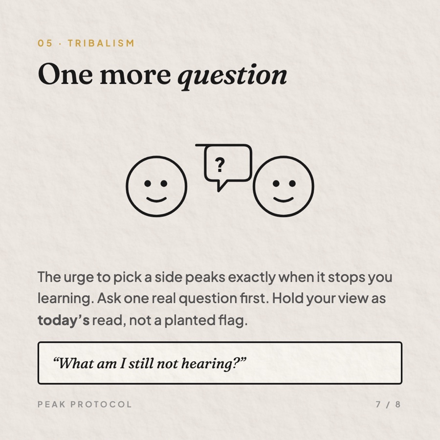
This is the one I am worst at, which is probably why I needed a rule for it.
In a debate about how to structure a guide, or whether a feature is ready to document, I feel the pull to plant a flag early. To decide I am the verify-first person and the other writer is the move-fast person, and to argue from there. The trouble is that the urge to pick a side gets strongest at exactly the moment when picking a side stops me from learning anything new.
So I make myself ask one more genuine question before I state my view. Not a rhetorical one dressed up to win. A real one, where I might hear something that changes my mind. And when I do give my opinion, I try to hold it as a position for today, not a flag hammered permanently into the ground.
That last move has a hidden benefit. When you treat your view as today's best read rather than your identity, conceding to better evidence stops feeling like a loss. It is just an update. The AI model that corrected my article did me a favor, and I could only see it that way because I had stopped defending the old version as *mine.*
## Fifteen minutes on a *Sunday*
None of this sticks without a quick look back. Once a week, fifteen minutes, I run five questions. Was my self-talk believable this week, or just noise? Which mistake bled into the work that came after it? Where was my first instinct right, and where was it wrong? Where did I call something a disaster when it was only slow? And then the only one that really matters: one thing to do differently next week. Just one.
That last column, the right-and-wrong tally on first instincts, is the quiet engine of the whole thing. It is how the fast read earns more trust over time, or learns to stay humble. Without the audit, the protocols are just nice ideas. With it, they calibrate.
## Where this *breaks*
A fair warning, because I have watched myself misuse all five.
Do not reach for the fast first-thought call outside your real expertise. Do not relabel a genuine problem as an inconvenience just to feel better, because a real problem demands real resources and wishing does not summon them. And when a decision is truly large and hard to undo, do the opposite of everything above. Slow down. Gather what you are missing. Bring in someone who knows more than you. These are tools for the everyday hijacks, the ones that quietly tax a hundred small calls a week. They are not a license to wing the things that deserve your full, patient attention.
But for the rest? For the meeting you are dreading, the mistake replaying in your head, the decision you have somehow been making for an hour, the setback that feels like the sky falling, and the argument you are itching to win?
> Name the hijack. Reach for the line. Play the next point.
*Adapted from a decision-making framework I keep returning to, retold through a year of running a small writing team and getting plenty of it wrong.*